
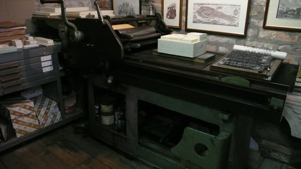
Proof one, counters
First letterpress proof of the text cut came off the press on Friday. The counters fill with ink where the screen looked fine. Back to the drawing board for the bowl of the g.
Open post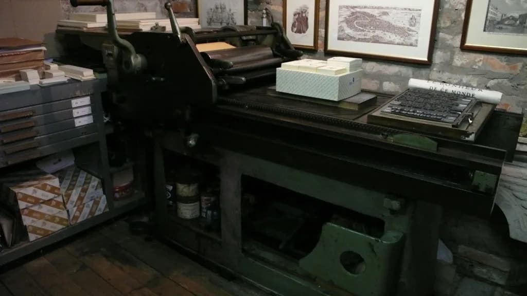
A text family drawn over two years, with corners that have been worn down on purpose. The idea came from signs I kept seeing in Berlin: shopfronts that were old but still doing their job.
The work is in the small things. Counters, the bowl of the g and the joins in the bold weights are all tested on letterpress proofs before they go into the digital files. The digital version looked fine for months and then the ink showed us the problems.
A generative experiment ran beside the typeface. It draws letter skeletons and then breaks them, and the outcomes fed back into spacing decisions for the final cut.
First letterpress proof of the text cut came off the press on Friday. The counters fill with ink where the screen looked fine. Back to the drawing board for the bowl of the g.
Open post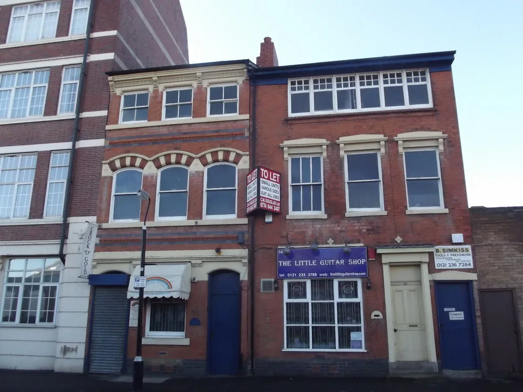
Found this sign on Torstraße and spent half an hour trying to name the typeface. It's not in any catalogue I know. That's the best kind of reference.
Open post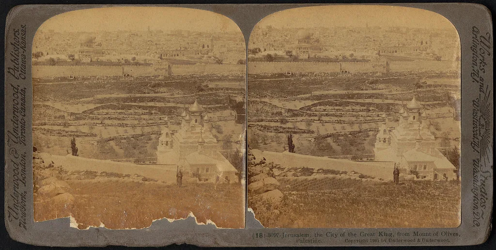
Night experiment: a script that draws letter skeletons and then breaks them on purpose. Printed at A2 and pinned above the desk. It's staring at me now.
Open postMedia unavailable in this environment
This video has no playable file here. The post and its details are still available.
Setting metal type by hand in a tray, one letter at a time. The old cases are still the best reference for spacing I have.
Open post